Supercharge Your Power BI Development Workflow - Build Reports More Efficiently
.jpg)
Audio Highlights
This component uses custom JavaScript to open and close. Custom attributes and additional custom JavaScript is added to this component to make it accessible.
Video Highlights
This component uses custom JavaScript to open and close. Custom attributes and additional custom JavaScript is added to this component to make it accessible.
Have you ever found yourself stuck in time-consuming and repetitive tasks and wondered how to make your work more efficient? If the answer is yes, and you are a BI specialist who uses Power BI, I am excited to share few tricks that helped me greatly improve my report development.
It does not matter if you work with Power BI on the daily basis or you’re just starting to use it – this article covers both basic and intermediate tricks using native and external tools.
Not only are they applicable for data visualization but also quick data model development and adjustment.
Reduce your efforts spent on formatting visuals one by one
Applying changes to multiple visualizations at once is possible by selecting the visuals to be formatted in the Selection Pane. No need to bold the title of 5 charts or change the width and height one element at a time anymore.
I recommend creating a group for such visuals - this way you don’t have to find the right visuals on the list of all visualizations and select each one of them. Click on first group element instead and hold Shift while clicking on the last group element to highlight the entire group content.
.gif)
Tip: Visualizations have to be of the same type (for example column chart + column and line chart) in order for this bulk format function to work.
Copy formatting to other visuals with Format painter
Similarly to previous tip, if you have a nicely formatted chart you can copy the styling and quickly apply it with just a few clicks to another visual by using Format painter.
Very helpful when copying elements from previous reports with different colors and fonts and to maintain visual integrity throughout all pages.
.gif)
Tip: Components don’t need to be of the same type for Format painter to use. However sometimes not all formatting options are copied as they may vary between different visuals.
No more manual components alignment
Most pages contain multiple elements – text boxes, filters, KPI cards, charts and more. It might be a struggle to try to manually place them so that everything is aligned horizontally and vertically.
Thankfully, Power BI has options for a quick alignment that can be found under Format -> Align option. Alignment of multiple components even of various types is possible (for example align KPI card and a bar chart to the left).
It is an easy way to not only save time but also make your reports look clean and easy to read with all elements distributed evenly and no visual distractions from your data.
.gif)
Tip: You can also align an entire groups of visualizations to each other by selecting the respective groups in Selection pane and choosing the alignment option.
Change data field used in slicer in all places at once
Slicers allow users to filter data by dimensions, such as country or year, which makes them one of the most used report components. Now, imagine you are maintaining a large report with multiple pages and slicers and you are asked to change the data field used for a certain filter. It can be quite timely to make sure your edits are applied and consistent throughout the entire file page by page.
The solution for such cases is the Sync slicers option, which displays a list of places where your selected slicer is used. Under Advanced options we find a checkbox that allows to propagate slicer changes across the entire report: Sync field changes to other slicers.
If that option is checked, then you only need to change the field once (for example from Region to State) and all other slicers that previously used Region column will be updated as well. Unfortunately, this trick does not work for formatting changes – changing the color, title or font of slicer does not get propagated.
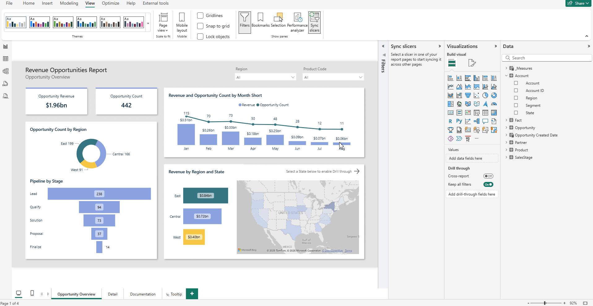
Tip: In the Sync slicers menu you can also see if a slicer is synchronized across pages - meaning that if user selects a country on the slicer in the first page, the same selection is applied to the other pages that contain the same country slicers. This solution ensures that users don’t need to apply the selection on every single slicer one by one to obtain a subset of data filtered in the same way.
Generate Power BI themes effortlessly
You have probably already heard of Power BI themes – a functionality that allows to apply consistent formatting options on the entire report with a JSON file which contains visual setup – fonts, font sizes, primary colors etc.
It surely allows to save many hours when the report’s color palette has to be changed, but the process of setting up a theme from scratch can be exhausting due to many options and no possibility to see how the report will look like until you click Apply.
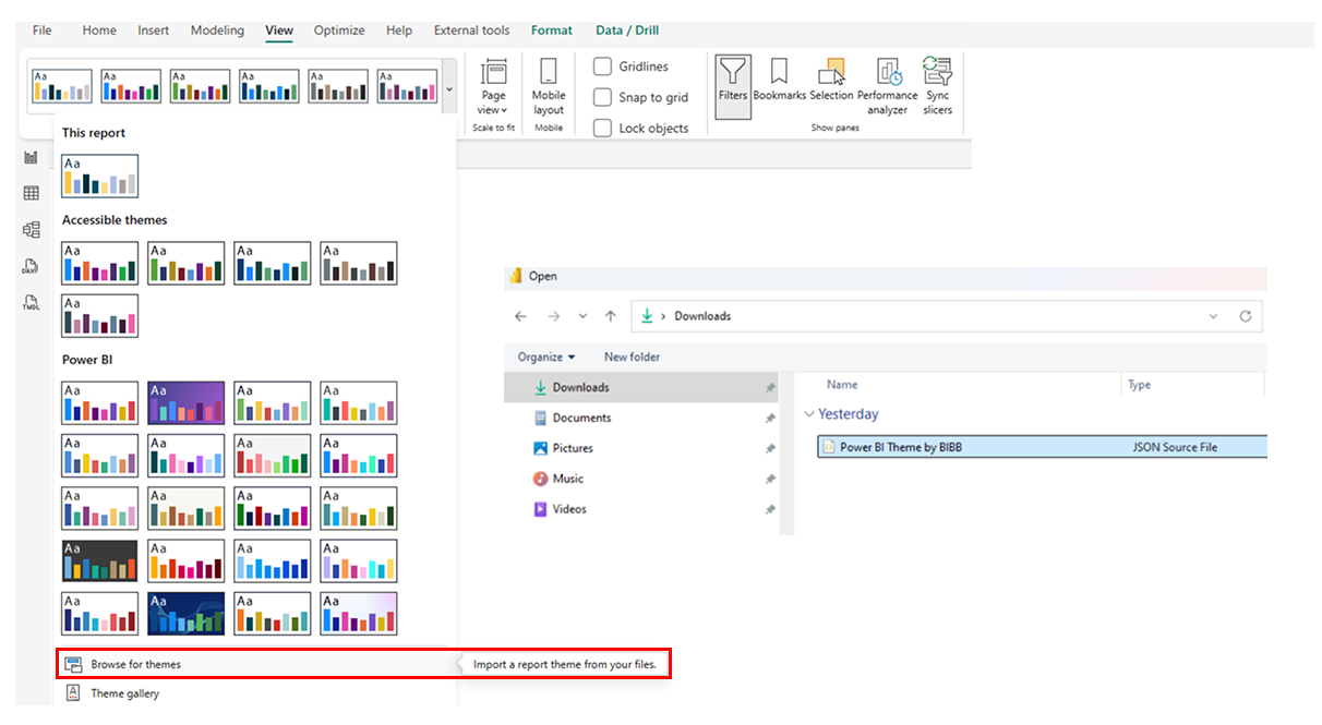
My favorite tool to speed up this process is Theme Generator by BIBB which is a free tool for BIBB’s newsletter subscribers. It allows developers to use some already built presets or to create your own with live preview of your theme. When satisfied with the outcome, download the JSON file and upload it into Power BI.
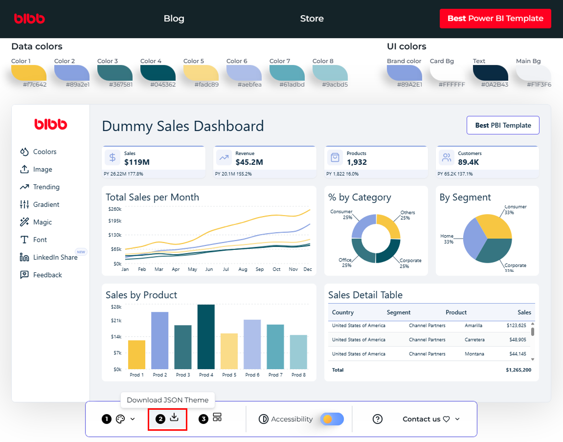
Tip: This tool is even more efficient with Coolors color palette generator – once you generate, select or create your own palette you can save it and import to BIBB’s tool. Coolors also checks for color contrast with white and black text and offers various lighter or darker shades of already selected color.
.png)
Reuse common tables between your data models
The best example for this tip is the calendar table which can be found in every data model as most requirements include analyzing values by date or comparison between periods.
Calendar table can be created straight in the data source, but it is not always possible. Personally, I most often create a date table using DAX CALENDAR() function with specified MinDate and MaxDate variables. After developing reports with various cases based on time analysis I have come up with a formula that consists columns useful for such reporting like the basic Month, Month Name, Quarter, Year Quarter, Year Month Name etc. but also flags such as Is Current Year, Is Last Month, Last Month of Quarter.
Advantage of this approach is that it is easily reusable. When creating a new project it is very quick to copy and paste the DAX formula and adjust the start and end date.
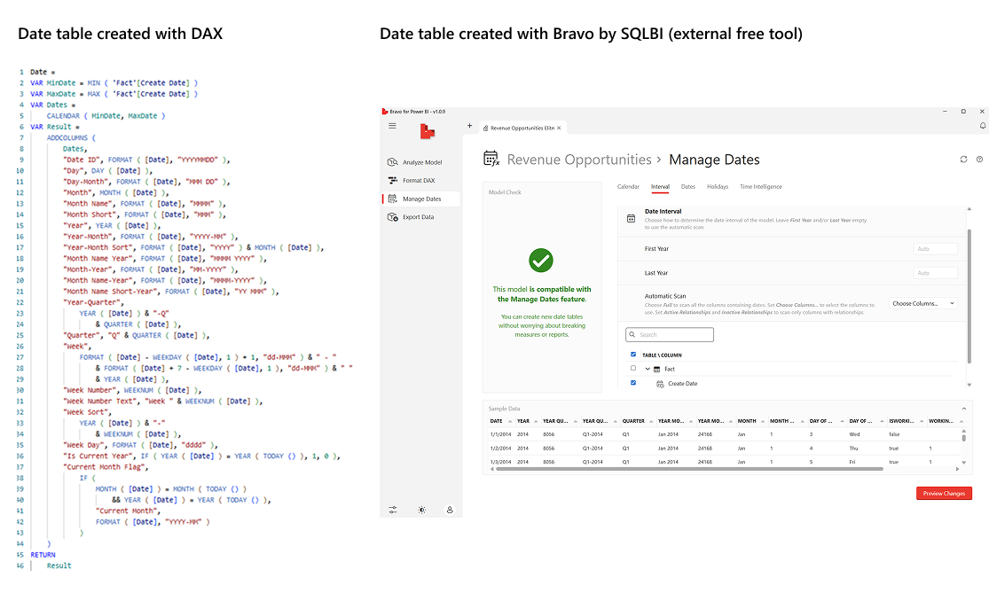
That is one way to do it, but if you are beginning your journey with Power BI, you might not yet have your own calendar formula. For such cases I would like to recommend using an external free open-source tool created by SQLBI called Bravo.
Instead of writing DAX code by yourself you can navigate through Bravo’s option to set first day of the week, interval, start and end dates for your calendar and also a holidays list for some countries. It can also generate the most common Time Intelligence measures based on the data model – for all measures or just specific ones that you can select.
Tip: Bravo can also be used to determine model size, unreferenced columns which can be removed to optimize performance, format your DAX measures or check for errors within measures – overall a very useful tool to speed up your work and find out more about the data model condition.
Easily document your report with these simple DAX functions
Documentation is crucial for maintaining Power BI reports – without it, coming back to a solution which you developed a while ago might be challenging. Preparing such file will spare hours spent trying to remember all the details behind the calculations and datasets logic, purpose and decisions made along the way. Sometimes projects are being handed over to maintenance team and in such cases well-described instructions ensure smooth knowledge transfer to the new team and reduces reliance on original developers. As important as these instructions are, writing them often becomes a time-consuming process as well.
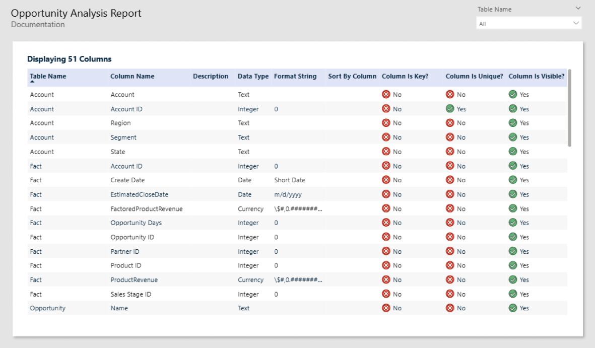
With the introduction of INFO.VIEW functions it is finally time to say goodbye to manual data model descriptions. This solution is automatic, meaning that if anything in your data model changes, your manual input to reflect those edits is not required. These functions generate calculated tables within your data model, and their content is updated automatically after each adjustment.
INFO.VIEW functions store information about tables, columns, measures, relationships and their attributes – for example measure expressions, format types or descriptions.
- INFO.VIEW.TABLES()
- INFO.VIEW.COLUMNS()
- INFO.VIEW.MEASURES()
- INFO.VIEW.RELATIONSHIPS()
Thanks to Martyn Booth’s auto documentation template where those functions are used I was able to create below sample report page in just a few minutes – it is definitely worth checking out.
Tip: Adding descriptions to your semantic model plays a big role in creating a comprehensive documentation that describes not only technical details but also business logic behind data fields and calculations. This approach allows reaching a wider group - from BI developers and maintenance specialists to dashboard’s end users.
TMDL as a game-changer for effective report development
One of the greatest features that has been released recently in Power BI Desktop is Tabular Model Definition Language (TMDL). This structured, text-based format allows developers to make bulk adjustments, makes code more reusable and easier to manage with version control. It also has a preview feature to compare current version of the model to the one after changes line by line.
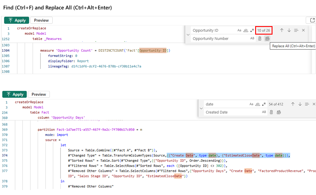
For example, if a column name is changed in the data source and after refreshing the dataset all the measures break due to Power BI not being able to reference this column. Instead of manual fixes, use Replace (Ctrl+F) to bulk update the name in measures that display an error and save yourself the struggle. Be cautious while renaming specific column names in the entire semantic model code. For example renaming Date column as this word is used in TMDL to specify columns format.
Personally, I prefer modifying DAX measures in TMDL rather than using user interface which sometimes loads slow, however one important thing to mention is that IntelliSense is not yet available in TMDL.
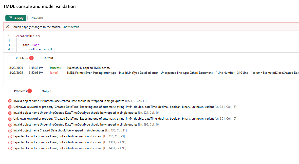
Therefore, when making changes in DAX formula, make sure your syntax is correct or the measures will break. You don’t have to worry about adding model breaking changes though – TMDL view has a console that displays if changes you tried to apply are correct and describes the issue if an error is returned. It is still recommended to save your work before applying model changes, as they might be irreversible with Ctrl+Z.
Tip: TMDL also allows to view M query code and therefore connecting to the same data as in previous reports, without spending time on navigating through the Get Data menu and filling up the connection string details once again.
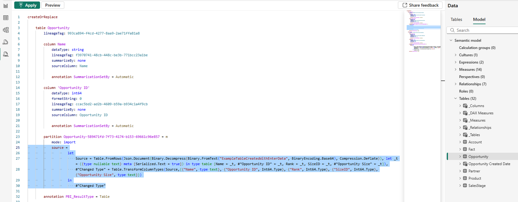
To do so, select tables to be copied in TMDL view, then drag and drop into the editor to view the M query details (highlighted in blue). The highlighted code can be then pasted into Power Query Advanced Editor to connect to the same source table and reproduce the M query steps or you can simply paste the entire code snippet shown on picture below (from createOrReplace to annotation) to TMDL view of blank report file and press Apply to add this table to new data model.
After adding the table using TMDL it might be necessary to refresh the table’s Schema and Data for the data to show in Table view.
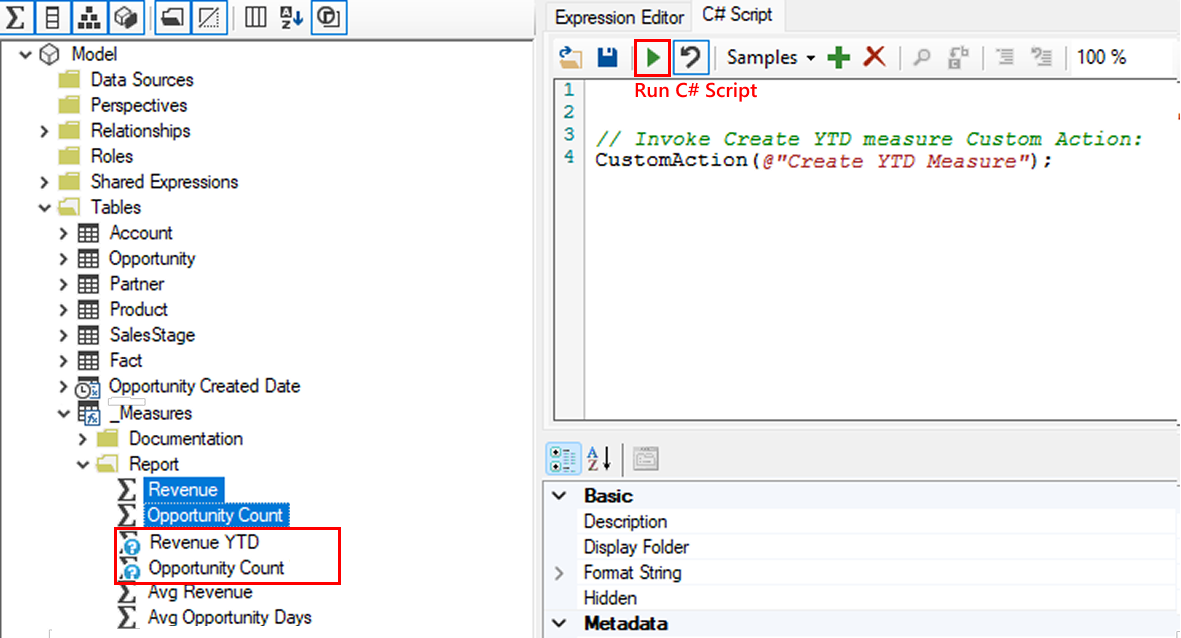
Accelerate your work with Tabular Editor and C# scripts
Tabular Editor is an external tool that is well known in the Power BI community, greatly appreciated for the flexibility and automation it brings to model development. It allows to change model attributes that are not accessible from basic Power BI Desktop user interface.
Its highly useful feature, which is the possibility to use C# scripts inside Tabular Editor, allows developers to automate time-consuming and repetitive modeling tasks such as bulk creating measures or maintaining consistent naming convention. No need to worry if you are not familiar with C# as the script library is available in the documentation along with practical examples.
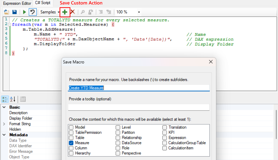
Those snippets can also be saved as Custom Actions and easily accessed again – for example set up actions that creates Year To Date calculation, save it using the green plus icon, select a measure from the list you want to generate it for and invoke the action’s name. Choose multiple measures to save even more time.
Built it fast. Now make it beautiful.
Hope this article helped you pick up a new trick to add to your routine and boost your productivity. If you're already applying these tips, the next step is making sure your reports also make the right impression.
Our colleague Mikołaj Rudnik covers exactly that in "Designing Power BI report – why details matter?" – from layout and alignment to colors and fonts, everything you need to know to create reports that people actually enjoy using.
Which of these tricks are you already applying in your work? What other approaches do you use for smooth visualizing, quick development and easy maintenance? We'd love to hear from you – reach out to us here.
Meet the authors


.png)
.png)


.png)


.png)