Designing Power BI report – why details matter?
.jpg)
Audio Highlights
This component uses custom JavaScript to open and close. Custom attributes and additional custom JavaScript is added to this component to make it accessible.
Video Highlights
This component uses custom JavaScript to open and close. Custom attributes and additional custom JavaScript is added to this component to make it accessible.
Your Power BI report shows the right numbers – but nobody reads it. Sound familiar? The problem is rarely the data. It’s the design.
For many BI report creators, report design comes as an afterthought – a nice addition to the final product, that are correct numbers shown in report. However, design and functionality are integral parts of good report – for the final product it as important to show relevant and correct information as how well the information is presented.
This article covers what good design is, why it matters and what it consists of.
Why design matters?
There are many reasons why design matters, but to put it simply – people like well-designed things. Whether we like it or not, design is all around us. Cities, buildings, interiors, furniture – after entering a neatly designed space, we inherently feel good in it, and just as quickly, we can usually tell that something is off, even if we can't tell what exactly.
The same pattern follows into the digital world – open any app on your phone and you will experience hundreds of hours put into a design, created to make you feel certain emotions, take certain actions, or keep you in the app as long as possible. And reports are no different – a well-designed report will keep your audience engaged for longer, be easier to digest, build end users' trust in the presented data, and highlight the most important metrics that drive action.
What to focus on ?
Plan the design early
As mentioned above, treat the design as a part of the report, so make sure that some time is reserved for this task.
If your company already has design templates, make sure to use them and plan report around it. If your company doesn’t have that, it is a good idea to create it – sure, it will take some time to prepare good templates, but in the long run, it can save a lot of time and keep reports consistent across organization.
Report layout and structure
This is a foundation of a good report – if the report feels well thought out, with easy-to-follow visual hierarchy, grouped elements like filters, navigation buttons and visuals, that are consistently in the same places across all of the reports, users have easier time learning how to interact with the reports, can retrieve important information faster and trust the results are correct.
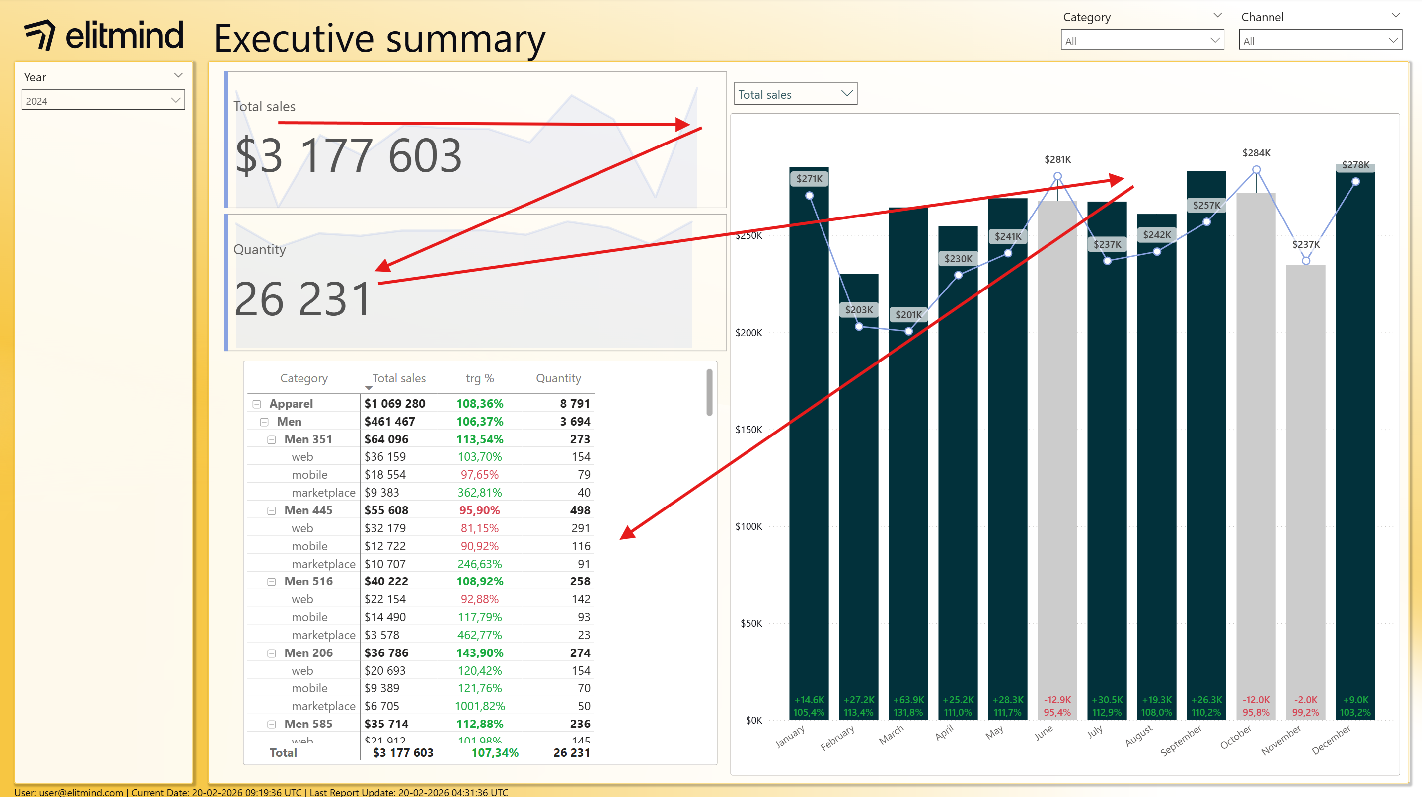
Look at the following report:
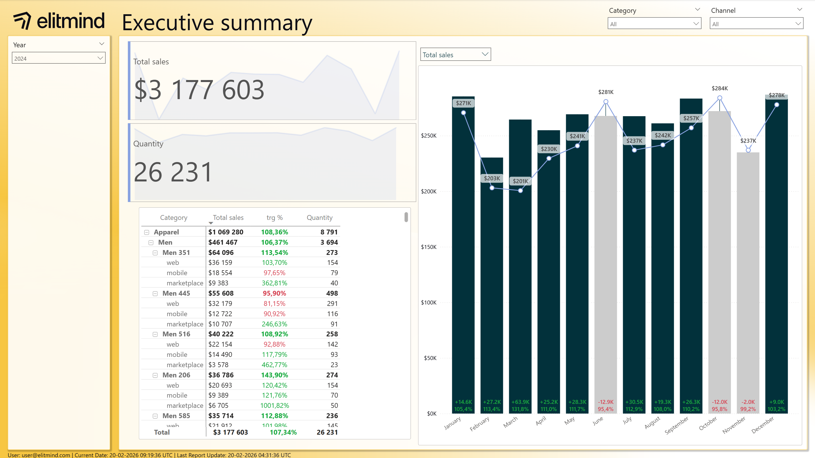
Report 1
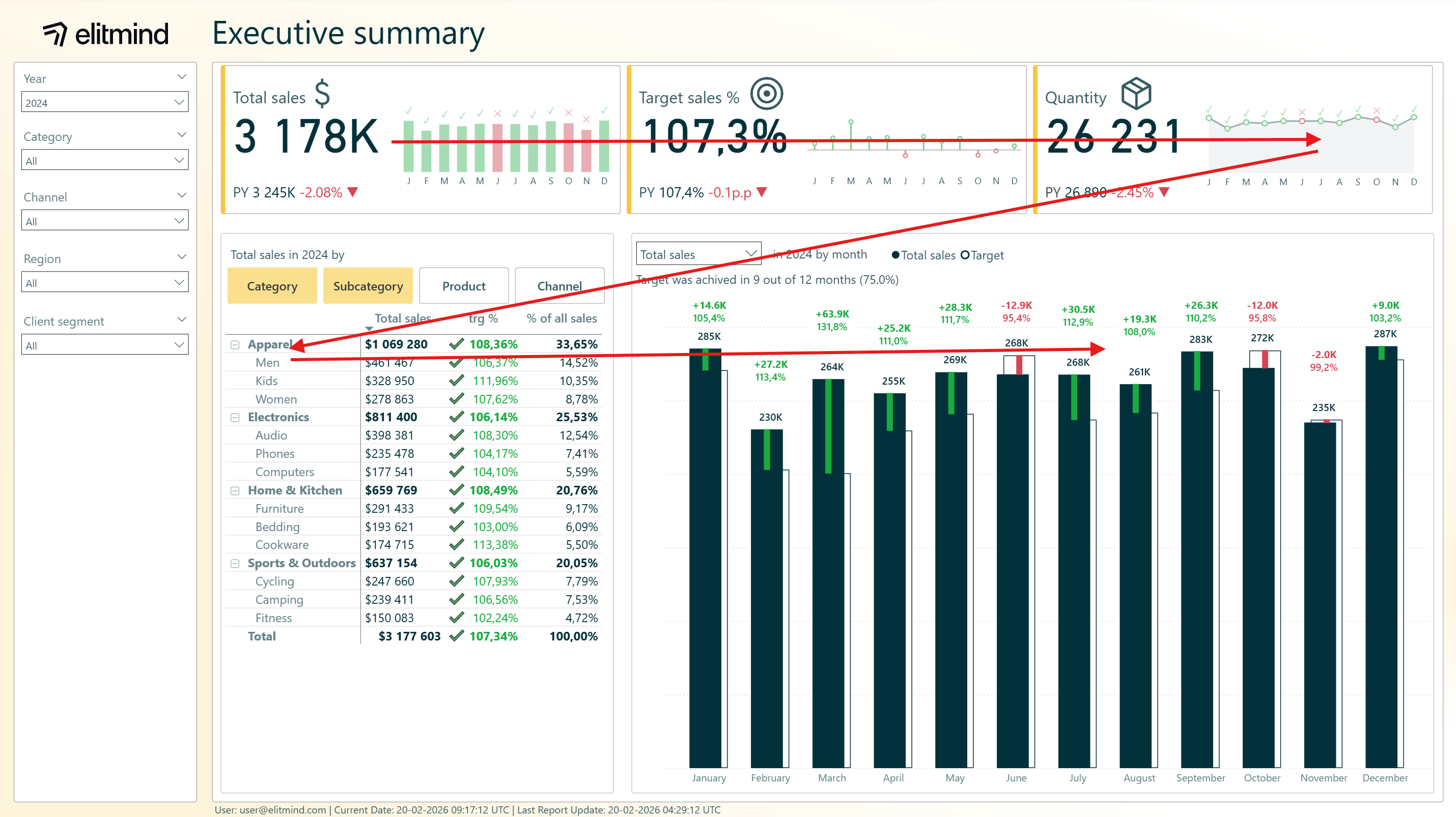
And now compare it with the report below:
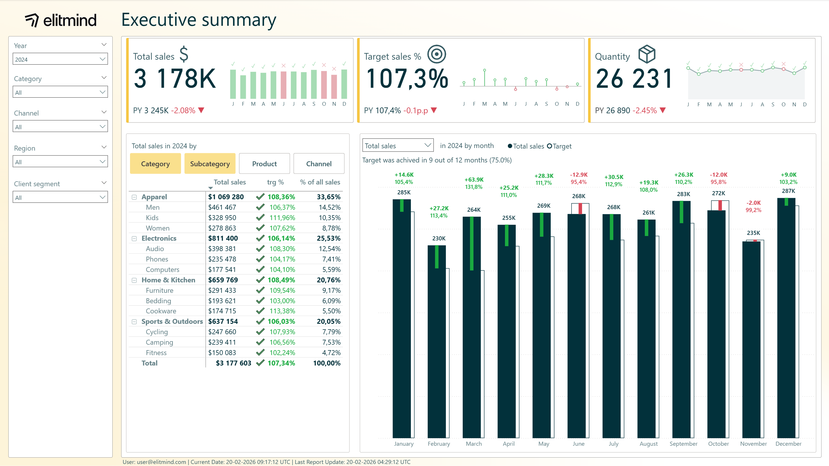
Report 2
Both reports have the following canvas dimensions: 1080px x 1920px.
Report 1 feels messy and inconsistent – visual hierarchy is broken, filters are in two places, looks like it was unfinished and it is harder to read. Report 2 feels cleaner, purposeful, with clear hierarchy and looks like a finished product.
There are many factors that contribute to that feeling, which will be analyzed in the next paragraphs. In this point, lets focus on the layout – how does it contribute to the difference between two reports.
There are two main patterns for people to read information on the page:
- “Z” pattern
- “F” pattern
In both cases, most important place on the page is top left corner, because, it is first place, where people start reading.
Report 1 doesn’t follow any of them, so it creates uneasy feeling when looking at the report. Additionally, slicers placed both in the pane on the left and in the top right corner, amplify visual mess:
Report 2 follows “Z” pattern, so visuals hierarchy is consistent with natural pattern for the brain, and all the filters are placed in the same segment:
While white space (empty space) in the report is desired, Report 1 feels like something is missing – white space should be used to emphasize important elements and information or create breathing room between the elements, so leaving random empty spaces, like in Report 1 matrix brakes consistency and order of the report.
In this case, both reports keep optimal number of visuals on the page, so it is not overcrowded – this is a common issue when creating reports. When facing too much information on one page, try to break into more pages, add contextual tooltips or drilldowns, that will reduce information shown on one page.
Alignment
Alignment is usually one of the most forgotten aspects of the report design – while planning report layout, calculate beforehand how much space for visuals will be available and how big distances between elements will be available.
In Report 1 visuals look like they were placed in random places, each has different height and length, distances between visual are not consistent and no clear pattern can be determined.
Report 2 keeps consistent distances between visual elements and the frame, and between elements themselves. This creates consistent grid, which is easy to follow and makes reading the report easier. In Report 2 distance between frame and visuals is 12 px and between visuals 24 px.
Background
Creating good background sounds easy, but usually it is tricky to get it right.
In Report 1 background is too intense and used colors have too much saturation – background draws too much attention and is distracting when looking at the data. In Report 2 case, the background is the same gradient as in Report 1 case but is toned down. It keeps it interesting and keeps the gradient with the “Z” pattern flow, while staying in the background layer.
Background should be consistent between report pages, ideally between all the reports in an organization, or department, or business unit – for example, report is sales department can have yellow background, while reports in marketing can have blue, to make it easier to distinguish from which department report is from. It depends on organizational practices, but at least, consistency should be kept between the pages of one report.
Additionally, in the examples above, background keeps layout consistent – logo, panes for slicers and visuals are part of the background, to make it easier to keep consistency while creating new reports.
Fonts
Fonts are one of the most important aspects of good design in report. If report is hard to read, then it will not be used very often. Also, they make great part of overall visual feeling of the report, so it is crucial to get them right.
First and foremost, select up to two fonts – one primary, used for most of the text and complementary, used to emphasize some numbers or titles. Primary font should be sans-serif (in example reports Segoe UI was used) and complementary serif font.
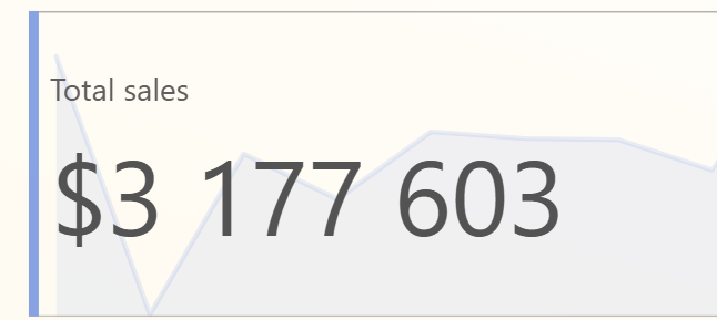
Fonts size, weight and color should establish a clear hierarchy – bigger, bolder and more contrasting fonts for elements like titles or KPIs values, and smaller, regular and toned fonts for more common elements like values in visuals, axis values etc.
In Report 1 title is too big and misaligned with the logo:
For the KPI cards titles, they are too small, with too little contrast, so their visibility is low:
Overall texts on the page have the same size (12) different colors are used for no apparent reason.
In Report 2 title uses dark green color but not black – the same as data bars. Every other text, that is not conditionally formatted or shows numbers, uses the same, toned-down color, derived from the dark green used for title.
Colors
Colors in report should be used intentionally, to emphasize certain elements, add next layer of value and make understanding information from the report easier. It should not only be used as a nice addition, to make report ‘pretty’ – however it is desired to create reports that are pleasant to the eye, it should not be the main focus when selecting colors for elements in report.
Every report creator faced or will face a scenario, where colors in company brand book are not easy to work with, in context of creating report – for example red and black color palette. In that case, it is important to understand what the goal of the final report is – if it will be used as an internal tool, maybe it is better to go with different color palette, for example blue, orange and gray. Usually adding logo is enough to satisfy internal branding requirements, and report users do not need constant reminder what brand colors are. Colors in report should have functional application and be used as a tool to help with understanding what is shown in the report.
For reports that will be used more as a showcase – for example in a presentation or on the company website, it might be better to follow existing brand colors, even if this will not make report functionality better.
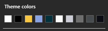
In presented case, both reports use the same colors in theme:
In Report 1 background color is too bright and intensive, colors of the titles and the text are mixed and over color usage fills like it was chosen at random for each element.
However, some good practices are still visible: use of conditional formatting in target realization, using lighter colors for axis labels and column headers or using dark color for actual values on the bar chart.
In Report 2 those good practices were elevated:
- selecting lighter, more subtle color for background, so the brand feeling was kept but it does not draw attention
- unifying text color on the page, with lighter green color, so it is easily readable, but does not draw too much attention
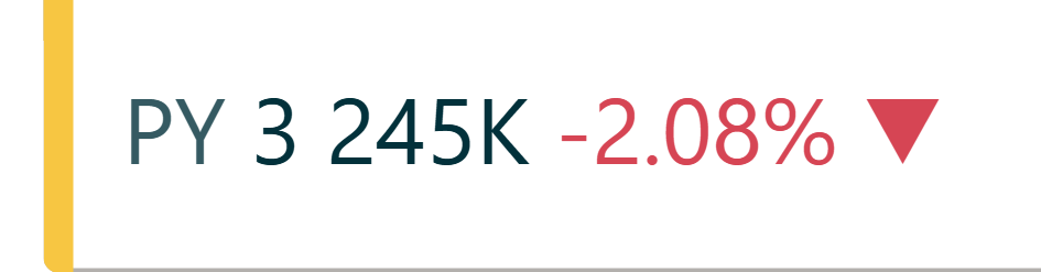
- making KPIs value darker, so they draw attention
- added subtle hints of brand color, with KPI cards yellow strips
Visuals
(correct type of visuals, clean visuals – nothing more can be taken away, data – ink ratio, best visuals for easy understanding, adding context to numbers)
Main goal of the visualization in the report, is to answer business question, so it is important, to not lose this goal during report creation. Adding too many elements or information to one visual may blur the most important information. One I heard a quote, that I believe describes perfect visualization: The perfect visualization is not when you can’t add something more, but when you can’t subtract anything.
Most important aspects of creating visuals:
- Select correct visual type: line chart for trends, bar and column charts for categorical data, KPI cards for important KPI values, avoid exotic visualizations like radar charts, that are hard to understand for average user.
- Add relevant and dynamic titles to the visuals.
- Keep data-ink ratio as high as possible – use color to emphasize most important information, not to make visual prettier, remove redundant information like labels and axis values in the same visual
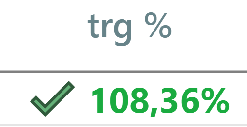
- Remember about accessibility – sometimes color is not enough as a differentiating factor, for example, green and red colors look the same for some users. To address that issue, apart from color, add icons to conditional formatting:
- Follow a standard for visualizatons – wheather it is IBCS, internal organization standard or sometnig between those two, keep visuals easy to understand. Keep those standards across all of the visuals, so the line charts on different pages, follow the same design pattern, and users will not be surprised with different design language.
- Add context to values – comparisons to previous periods, targets or any other benchmarks, so the users can understand context of the data easier.
User experience
Reports in an organization should use consistent design language for common elements, like buttons, slicers or page navigation – this allows users to get used to functionalities of specific elements, even across multiple reports.
Furthermore, it is also important to allow users to interact with the data, by adding relevant slicers, tooltips, drilldowns or interactive visuals, that allow end users to investigate the causes of interesting results.
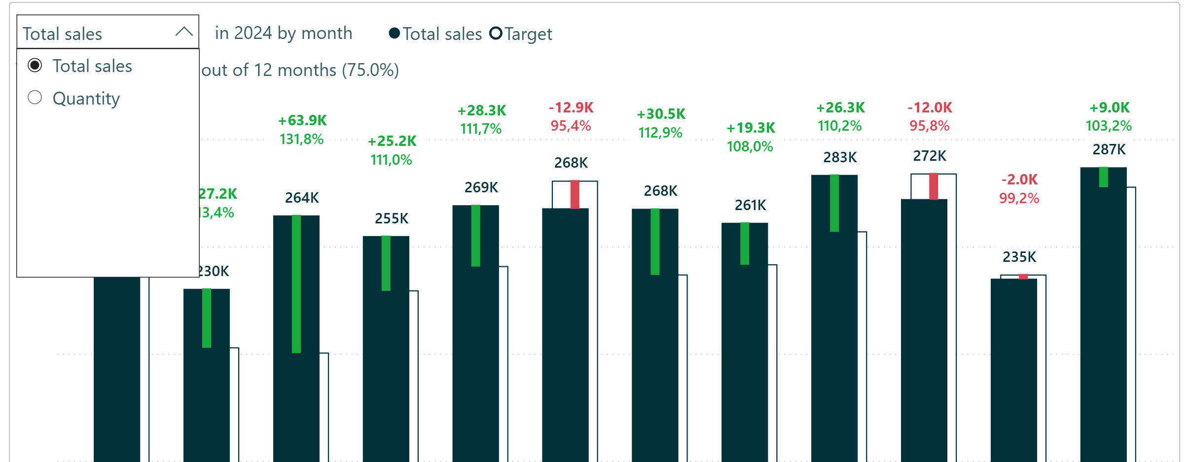
In our case, both reports allow to select dynamically what value is used in the bar chart:
In Report 2, option to change hierarchy of fields shown was added to the matrix visual:
.png)
It allows to select what fields are selected, and order of clicking of the buttons is shown in the matrix below, so it allows to see the data in selected perspective.
Consistency and standardization
To make reporting in an organization easier, faster and at the same time easier to use for end users, it is important have consistent and standardized approach in report creation.
To enforce that, organizational templates, motive themes and assets library for the whole organization should be created, documented and used obligatory, when creating new reports.
This allows to increase data literacy in organization – report creators can use consistent patterns and data language to answer business questions, and report users know how to read and understand them faster, with more accuracy.
Is your Power BI reporting living up to its potential?
I hope this article either helped you grasp the basic idea why design matters in report creation and understand or refresh basic concepts of good design patterns.
Design is the foundation – but efficient development is what makes great reporting scalable. Our colleague Aleksandra Petela covers exactly that in her article "Supercharge Your Power BI Development Workflow – Build Reports More Efficiently" – a perfect next read if you want to take your Power BI skills to the next level.
Have thoughts on report design? We'd love to hear how your organization handles it - reach out to us here
Meet the authors


.png)
.png)


.png)


.png)